
Reports, AI summaries and email summaries
Reports turn what you record into charts: where it went, plan against actual month by month, and one category over time. AI Budgie also writes short summaries of your month.
The three charts
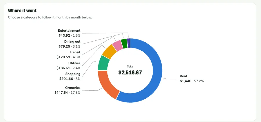
- Where it went: a month split by category, with the numbers beside it. Choose a category to follow it below.
- Plan vs. actual: month after month, the pale bar is the plan and the bar inside it what happened, red when it went over.
- One category over time: is groceries creeping up? The dashed line is the monthly average.
| Month | Planned | Actual |
|---|---|---|
| Apr | $3,200 | $2,980 |
| May | $3,200 | $3,090 |
| Jun | $3,200 | $3,410 |
| Jul | $3,250 | $3,120 |
| Aug | $3,250 | $3,380 |
| Sep | $3,250 | $3,040 |
Where it went in Sep
- Rent61%
- Groceries20%
- Dining out11%
- Transit8%
Where your money goes shows where money comes from and goes as a monthly average, and can be shared as an image with the amounts hidden.
Your month so far
The Overview starts with a few sentences about your month, written by AI from your totals. Show the numbers lists the figures behind each sentence. Only totals are sent to the AI, never single transactions; turn it off in Account.
Email summaries (Premium)
- Weekly: Monday at 8 am, last week in brief and a plan for this one.
- Monthly: the 1st at 8 am, a look back at the month.
- Year in review: January 1st, your year month by month.
Choose which you get in Account. Every summary you’re sent is kept under Summaries.
Was this helpful?